
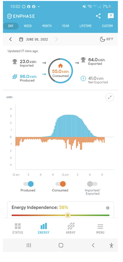
I’m enjoying monitoring our solar panels’ production. SolarEdge’s site provides more data than their iOS app, but the app is convenient for checking the system during the day. The UI won’t win any awards but it’s more than adequate for the task.
It’s illuminating (no pun intended) to see how a tree or chimney shadow, or a passing cloud, affects production.
We had two days with atmospheric smokiness, stemming from eastern Washington’s forest fires. One day we could smell the smoke. This affected production, too.
Here’s a fun oddity…
When photovoltaic owners share generation graphs of their systems, they’re usually a normal distribution. Not always, but usually. Unless something’s wrong with the system like a bad panel or a misbehaving micro-inverter.
Here are some images from /r/solar.


The curves have different means, amplitudes, and deviations. But it’s easy to visualize the sun rising, being overhead, and setting. In most cases, the panels are on one side of a roof or clustered together in a ground-level farm. No surprises here.
But here are my production curves from four consecutive days.

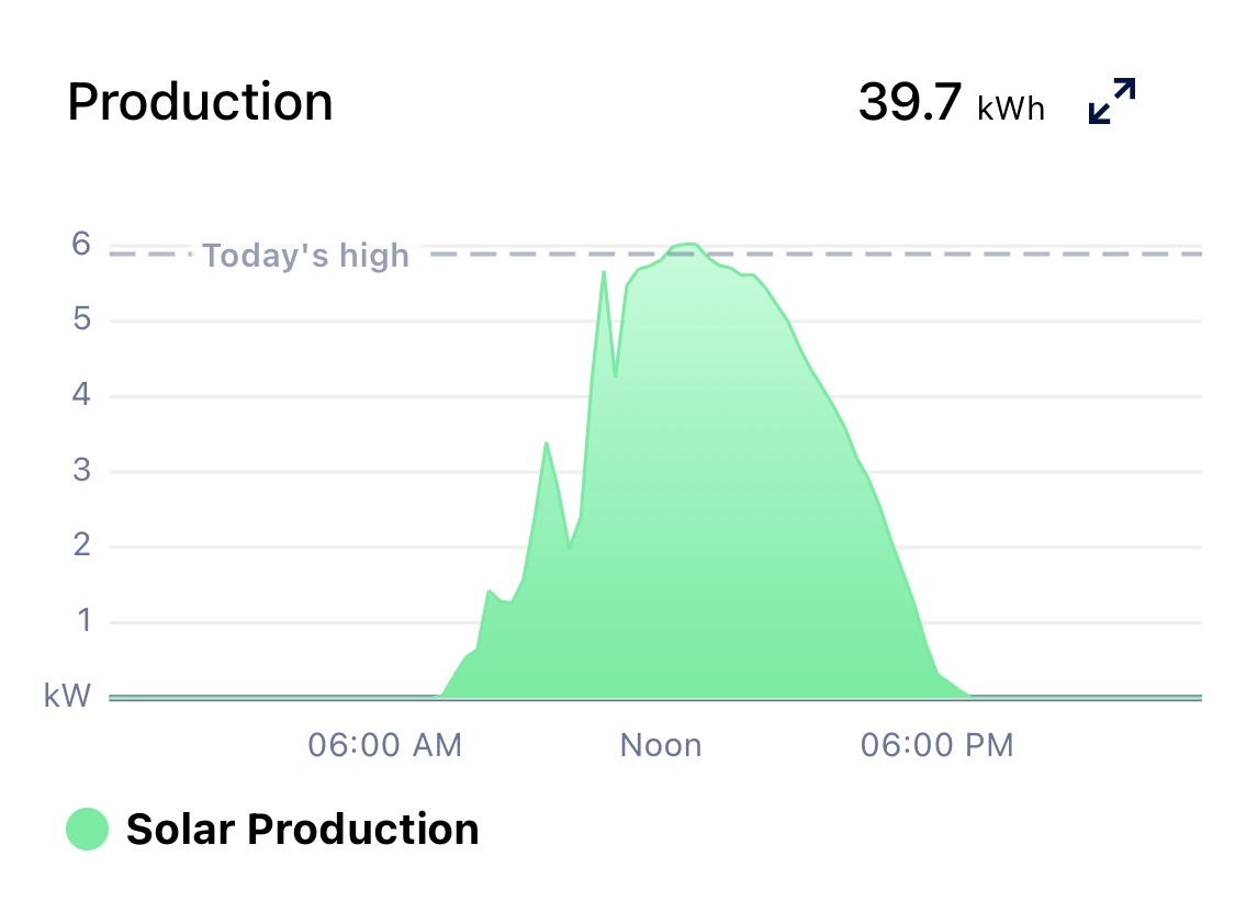


Whoa, what? Those aren’t smooth curves!
- Mea culpa… I didn’t note when clouds passed. And I didn’t record each days’ air quality (particulate) level. Some variation was surely due to atmospherics.
- But! There’s a plateau each day around 08:30 and then a production dip around 10:15. Both look different on each day but they’re always present.
- Two days had a production dip around 14:30. Two did not.
- Three days show clear irregularities on the production on the backside. One day had a smooth-looking decline, but if you zoom in you’ll see the slope changes.
So I’m pondering this…. And I start thinking about my roof and the changing arc of the Sun’s path in the sky.

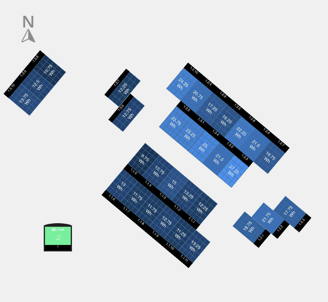
This is my panel layout. (The “North” compass is wrong. North is actually about 20 degrees counterclockwise from what’s in this graphic.)
But there’s the answer. My panel “farm” has five sections. They’re all oriented differently because they’re on different roof sections.
As the sun’s position changes, the sections receive different levels of solar energy. One section faces this way, one faces that way, and the others face other directions. It’s true that even in a simple layout, any two adjacent panels will receive different energy because they’re not occupying the same physical space. There’s a larger difference here because sections are facing entirely different directions.
This results in production irregularities at different times of the day. And this effect should change during the year as the Sun’s arc in the sky changes.
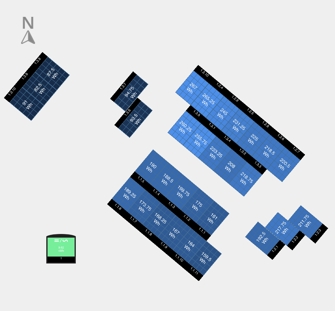
Proving this, here’s a sequence of panel output over most of one day. Each image’s name is the time when I took the screenshot. E.g., 1202 was taken at 12:02. I took snapshots at random times so there are varying time deltas. But you can see that different sections get light at different times.
(Dark color means no production. As production increases, the color starts at dark blue then moves to lighter shades.)
There’s also the effects of tree shadows and chimney shadow on some panels.


You charging the car off this same circuit? Looks like a complete with the net metering, and i suspect the various angles will make your layout more year-round robust. it’ll be fun to see as we head to the low south sun of winter months here.
All our generated power goes to Seattle City Light, so any variation is only an intellectual curiosity. Car charging wouldn’t have affected the graphs — they are entirely and only power generation graphs.
I’m considering adding consumption monitoring to our service panel, but that would be next year sometime.
This whole set up is supposed to supply about 65% of our annual usage. We shall see. 🙂